Your first component
This guide walks you through building a small button-like component: a container element with a text label inside, sized to fit its content.
New here? See Getting started for signing in and creating a project first.
1. Open the file explorer
Inside a project, the left sidebar's FILES tab lists your files. Expand COMPONENTS, then Atoms — atoms are the smallest building blocks (buttons, inputs, labels), so that's where this component belongs.
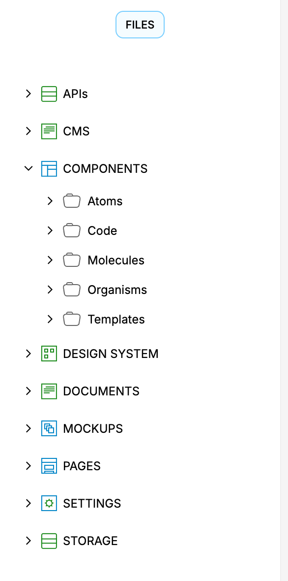
2. Create the file
Right-click Atoms and choose Create File. Enter a Name (for example Button) and click SUBMIT.
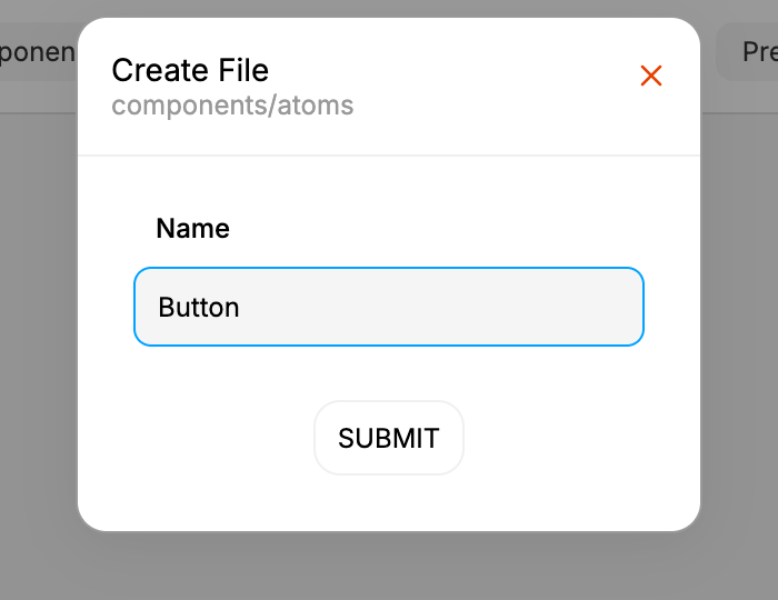
Double-click the new file in the tree to open it in the editor.
A name may only use letters and numbers and must start with a letter, and it must be unique within the folder — a clash keeps the dialog open and says a file or folder with that name already exists there.
3. Find the Body in the element tree
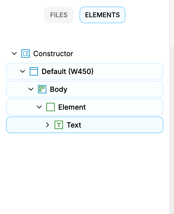
Open the ELEMENTS tab to see the component's element tree. Expand Constructor → Default (W450) and select Body — this is the root your component renders into.
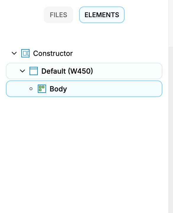
4. Add the container element
Right-click Body and choose Add Element. A new Element appears as a child of Body — this is the box that becomes the button.
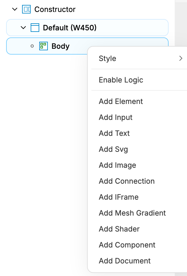
You can also draw it: pick Element from the draw dropdown on the canvas toolbar, then drag the box out inside the artboard.
5. Add the text label
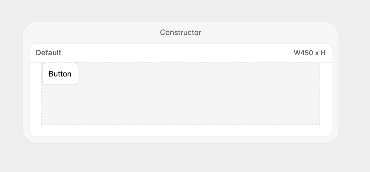
Select the new Element, right-click it, and choose Add Text. A Text node appears inside the element; double-click it on the canvas and type the button's label (for example Button). The label saves as you type, so click elsewhere to finish — Enter inserts a line break instead of committing.
6. Size it to fit the content
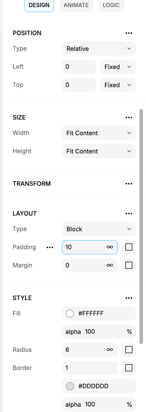
With the element selected, open the DESIGN tab of the style panel on the right:
In Size, set both Width and Height to Fit Content so the button hugs its label instead of staying a fixed box.
In Layout, set Padding to
10to give the label some breathing room.
7. Done
You now have a reusable button atom — a fit-content element wrapping a text label. Compose it into larger molecules and templates, or edit the label and styles any time from the element tree and style panel.
Next: Export your code — turn this component into React you can drop into an app.